
North America / Europe
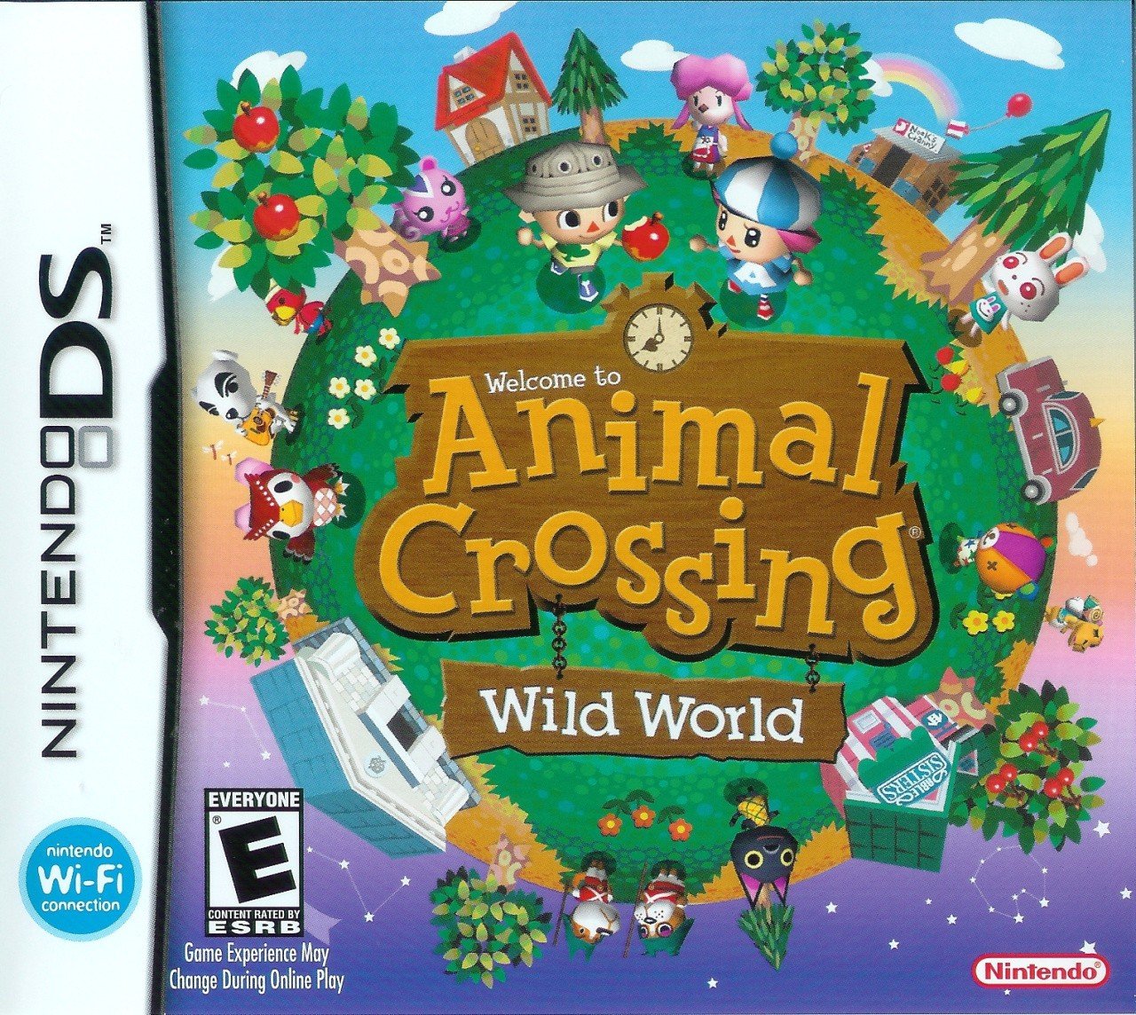
We’re all familiar with this one, right? The Western design is, well, it’s a world. What’s more, it’s adorable. Just look at those polygonal little guys going about their lives! It crams in a good amount of series iconography, too, with plenty of familiar faces, stores and floating packages. It’s just a very pleasing cover to look at.
Japan
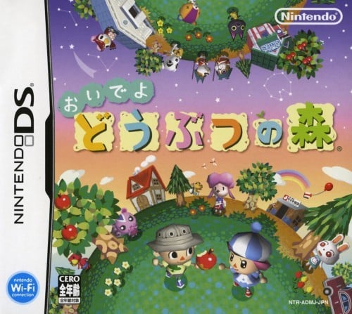
The Japanese design is similar, but different. Rather than present the world as a cohesive whole, this cover bisects it, pushing the characters from the Western box art to the top and bottom. All of the characters are still present and correct, but a few crop up in different positions to account for the division — get off the roof, Celeste!
It all leaves more room for the central logo, it’s true, but we miss the sense of unity brought by seeing the world as a whole. Maybe that’s just us, though.
Thanks for voting! We’ll see you next time for another Box Art Brawl.

